Since we are continually striving to perfectly match our customers' needs and want to offer the best possible service we had already launched our QQL (Quintly Query Language) last year. This feature enables all customers to create individual metrics for their dashboards and reports. Over the last year, together with our customers, we have created a huge base of custom metrics and we would like to share some brand new chart types with you.
Gauge Chart
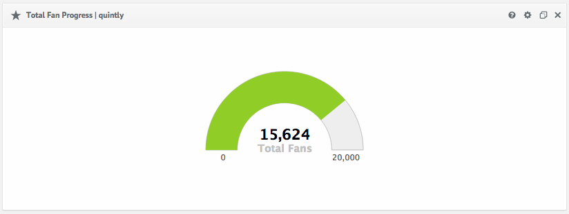
The Gauge Chart gives you the possibility to visualize a target you have set for any KPI in direct relation to the current status quo. It can be used as a targeting metric, for example, if you have a specific number of followers, number of average likes per post or interaction rate value you need to acquire within a certain time period. You can steadily compare the actual value with the set target to see how well you are performing. As in the example below, you can check your current total fan count against the individual goal you have set.
This chart type is especially useful for agencies managing a number of different client accounts. It helps keep track of all different targets much faster in one view.
Continuous Bubble Chart
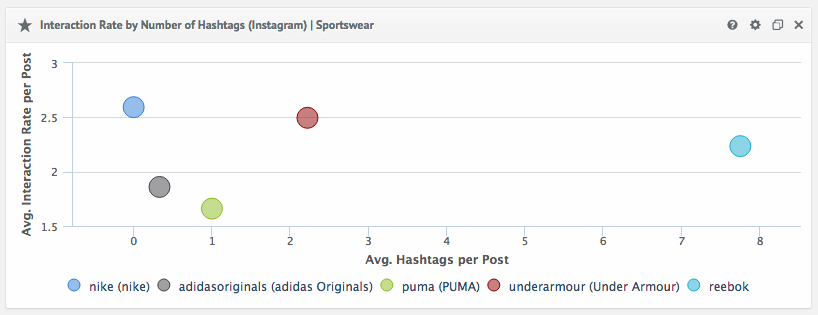
With the Continuous Bubble Chart we are taking metrics to the next level. On two axes the chart puts into relation any KPI to make it possible to compare both components across a whole industry or group of competitive brands. The example below shows the relation between hashtags and interaction rate. It visualizes the number of hashtags used on average per post in direct comparison to the average interaction rate per post across numerous sportswear brands.
The Continuous Bubble Chart can help you understand your competitors’ strategy much more in depth as well as your own relevance and positioning against them. Based on the insights you gain you can adjust your marketing activities to stand out against your competitors on Social Media.
Funnel Chart
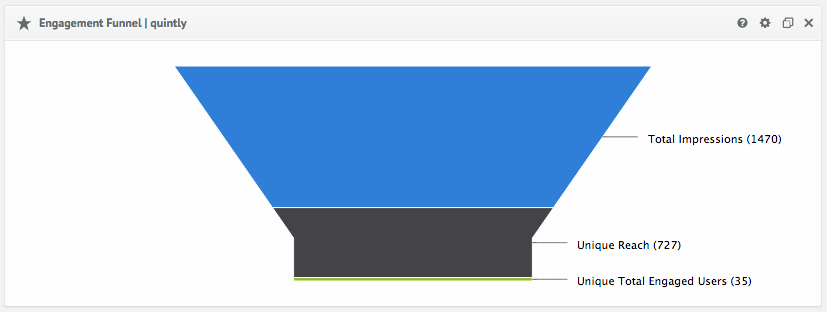
The third chart we want to present is the Funnel Chart. Also this chart is available for any combination of KPIs. In the case below it shows the total impressions, unique reach and the unique total engaged users on your Facebook page for a specific time period. The Total Impressions display the total impressions of anything associated with your page. The Unique Reach points out the number of people who have seen any content of your page and the Unique Total Engaged Users presents the amount of engaged visitors of your Facebook page. In the order mentioned, the KPIs build subsets of one another. As an example we picked the Engagement Funnel of quintly, because the KPIs used here are only accessible via the Facebook Insights. Because a funnel is useful for any set of KPIs that involve subsets, you could also display the channel views and unique views of your YouTube Insights.
We have developed these three new chart types in order to help you track more effectively and thus, optimize your social media activities and performance. To support you reaching your individual goals, we will continually create and publish more QQL metrics and visualizations.
How it works
The new graph types are available free of charge for all our customers. You can integrate the new chart types on your dashboard through creating a custom metric with the suitable QQL code. You can just let us know if you are interested in any of the graphs and we are happy to either provide you with the specific code or to set the graphs up for you. Please get in touch with us at support@quintly.com or send us a tweet @quintlyapp.


Join the conversation. Leave us a comment below!